
Logo and Branding
My work focuses on representing your essence in a way organicI want to create a image that connect with yours public and transmit yours values in each stroke.
Each brand has its own needs, and that's why we will build the process together, step by step. It's not the same if you're already an established brand or if you're starting from scratch, if you have clear ideas or need advice along the way.
The logo and branding will be your image, the one that will represent you and make you stand out from others. I will help you build a unique brand identity.
And what's the difference?
The logo is the image that defines you at first glance, while branding is the identity of your project, the essence of what you want to convey. This includes the colors, typography and icons, which accompany the brand's values and help create a coherent and recognized visual experience.
If you have any questions, write to me and I will help you throughout the process!
Essential Pack
Base Identity
If you are shaping your project and want a coherent image from the beginning, this pack is for you. The essentials to start showing yourself with confidence and a style that defines your values.
- Primary logo (with custom typography)
- Favicon (for web and networks)
- Palette of 4-5 colors (consistent and with suggested applications)
- Recommended typography (titles and base text)
- 1 icon or simple graphic illustration (e.g. for Instagram highlights)
- 1 editable template for social media or poster
- Includes initial meeting and 1 round of reviews
Complete Branding Pack

Living Identity
For brands or professionals who already know where they are going and want an identity with their own character. This pack helps you unify your style and convey everything that makes you different.
- Primary logo (with custom typography)
- Secondary logo + favicon (for web and networks)
- Palette of 5-6 colors (consistent and with suggested applications)
- Typography (for titles, fonts and special uses)
- 6 original icons or illustrations (your personal style)
- 3 templates (for networks, posters or presentations)
- Business cards (print-ready design)
- Mini identity guide (short to use PDF)
Branding and Web Pack
Ideantity & Presence
If you already have a clear idea of your essence and want your brand and website to tell your story coherently, this is your pack. Everything you need to take the step with confidence.
- Complete branding (logos, colors, typography, illustrations, templates and cards)
- Website with up to 4 sections, personalized design and adapted to mobile
- Favicon, form, basic SEO and domain settings
- Complete and editable delivery + basic training
Projects
These images are the visual summary of each brand, reflecting their specific needsSome have been a rebranding, working on an existing identity, while others were created from scratch. Some needed only icons or typography, and others wanted one complete package!
Here you can see a small taste of theessence of each in one quick look.
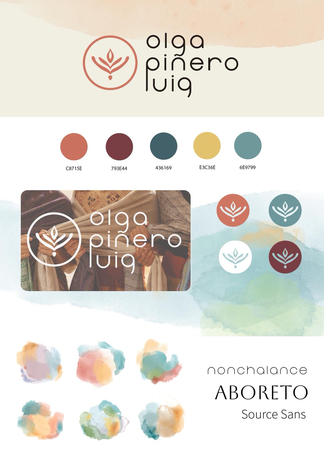
Olga Piñero Puig
Personal Brand
Branding and visual identity for Olga Pinero Puig, a reference in accompaniment with the Mexican rebozo, therapeutic yoga and healing processes from the body and somatics.
His deep and loving gaze invites us to return to the origin, undo layers and reconnect with its own essence.
The visual proposal is based on watercolors and translucent textures, which evoke the depth and subtlety of the processes it accompanies. The graphic language plays with overlays and subtle spaces, creating a visual metaphor of the layers that unfold until reaching the origin, just as watercolor is built up with layers until it forms its final essence.
The colors of the visual identity are inspired by the colors of the chakras, with shades that represent each service, while maintaining coherence and harmony in the overall timbreThe main color, an intense coral, brings strength and warmth, while the watercolors and translucent textures create depth and movement, reflecting transformation and accompaniment.
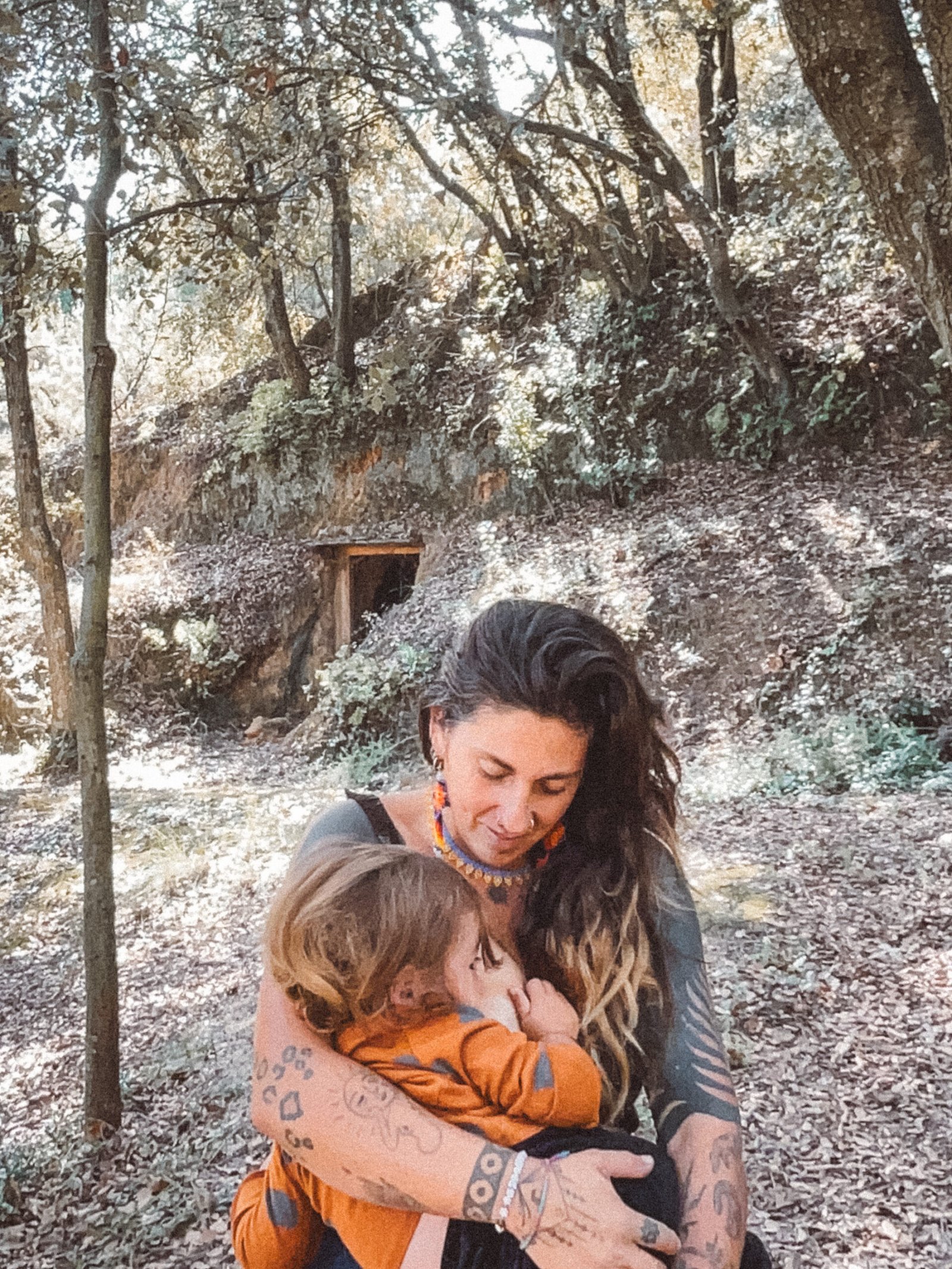
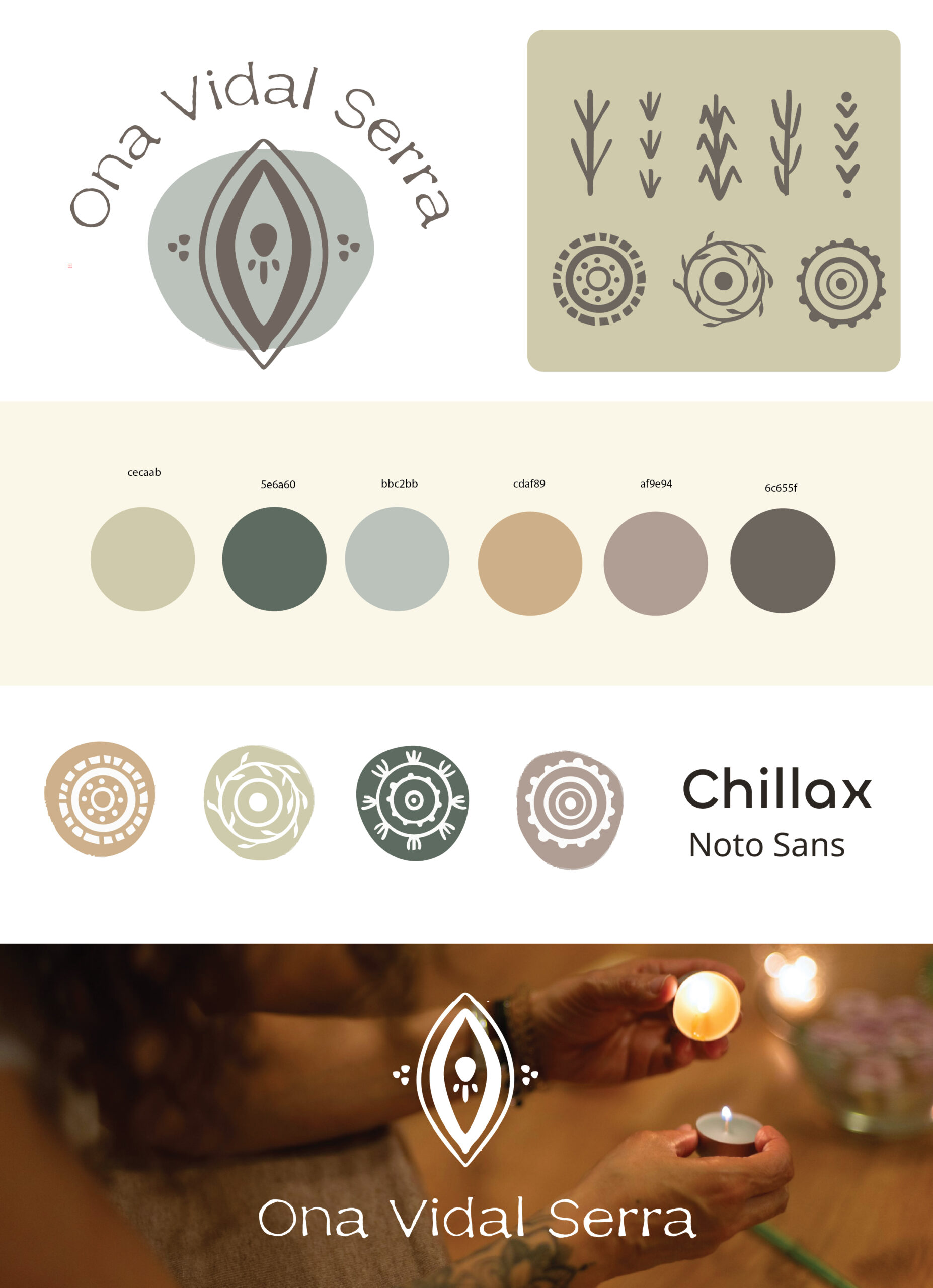
Ona Vidal Serra
Personal Brand
Branding and visual identity for photographer, doula and lactation consultant.
This project was born from the need to give visual form to the universe of Ona, photographer and doula, combining professionalism and sensitivity. Its brand is built on values such as ancestrality, femininity and accompaniment, and all visual development seeks to reflect this essence with coherence, warmth and proximity.
The logo is based on a organic composition incorporating oval shapes and repeated lines, symbolizing accompaniment, support and care. The oval shape highlights the eye, linked to photography and intuition, as well as the vagina as symbolic portal of transformation and creationOrnamental elements, such as dots and lines inspired by ancestral symbols, provide deep meanings: seeds, protection and life cycles.
The visual identity is completed with a soft, undersaturated color palette, from greens, ochres and earths to neutral grays. Despite being different shades, they remain within a harmonious range, allowing services to be differentiated with a specific color without losing visual coherence. The icons follow the same organic line, representing natural elements and providing a delicate visual texture, full of meaning.
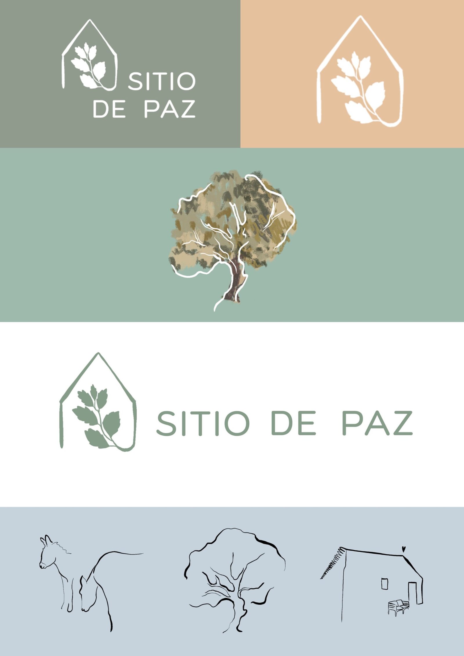
Peace Site
House for rent in nature
Peace Site is a project that combines accommodation, tranquility and nature in a privileged environment in the south of Portugal. For this assignment we have developed both the visual identity and the design of the web platform, with the aim of creating a serene, warm and functional digital experience.
The logo represents a leaf within an outline that evokes a house, a visual metaphor for shelter and harmony with the environment. The clean and soft sans-serif typography, reinforces the elegance and simplicity of the brand.
The color palette is directly inspired by the natural environment of the Algarve: the soft greens of the forests, the beige of the sand and the blue tones of the seaThis combination seeks to convey calm, balance and connection with the landscape that surrounds the accommodations, creating a coherent and evocative visual atmosphere.
In addition to the visual design, we have incorporated personalized illustrations that give the brand its own identity and reinforce the artisanal and natural spirit of the project. Small graphic details, such as drawings of the house, the tree or the horse, connect emotionally with the user and bring a layer of humanity to the whole.
With Peace Site, our goal has been to translate the calm of the place into a coherent, aesthetic and effective digital experience, fostering the connection between hosts and visitors in a space where time seems to stand still.
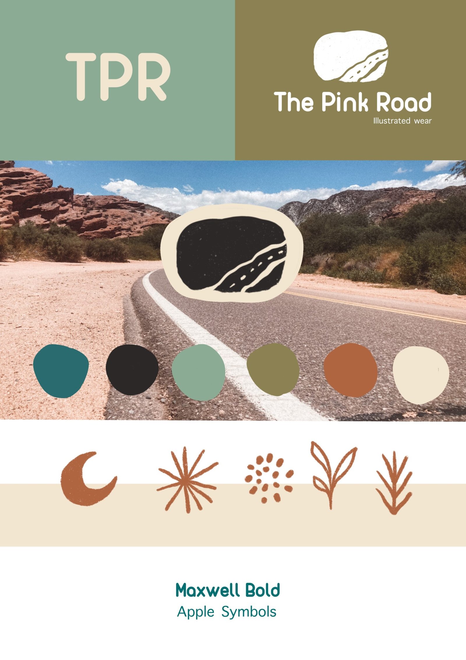
The Pink Road
Clothing brand identity
The Pink Road is a clothing brand created by a visual artist, with her own designs and a very personal essence. It is aimed at both children and adults, with a fresh, creative style and with a lot of sensitivity.
We have worked on branding and web design to reflect this artistic spirit and natural. The color palette is inspired by the landscapes of the American West: earth, desert, vegetation and open sky. The logo and illustrated symbols they connect directly with the artist's work and give each piece its own identity.
A project where illustration and fashion meet, with a unique aesthetic that highlights the art and detail in each piece.
Do you want us to work together?
write to me on the form or by email 🙂